Seolta Spirits’ Die-Cut Label Lets Its Scottish-Style Rum Shine

Seolta Spirits’ Die-Cut Label Lets Its Scottish-Style Rum Shine


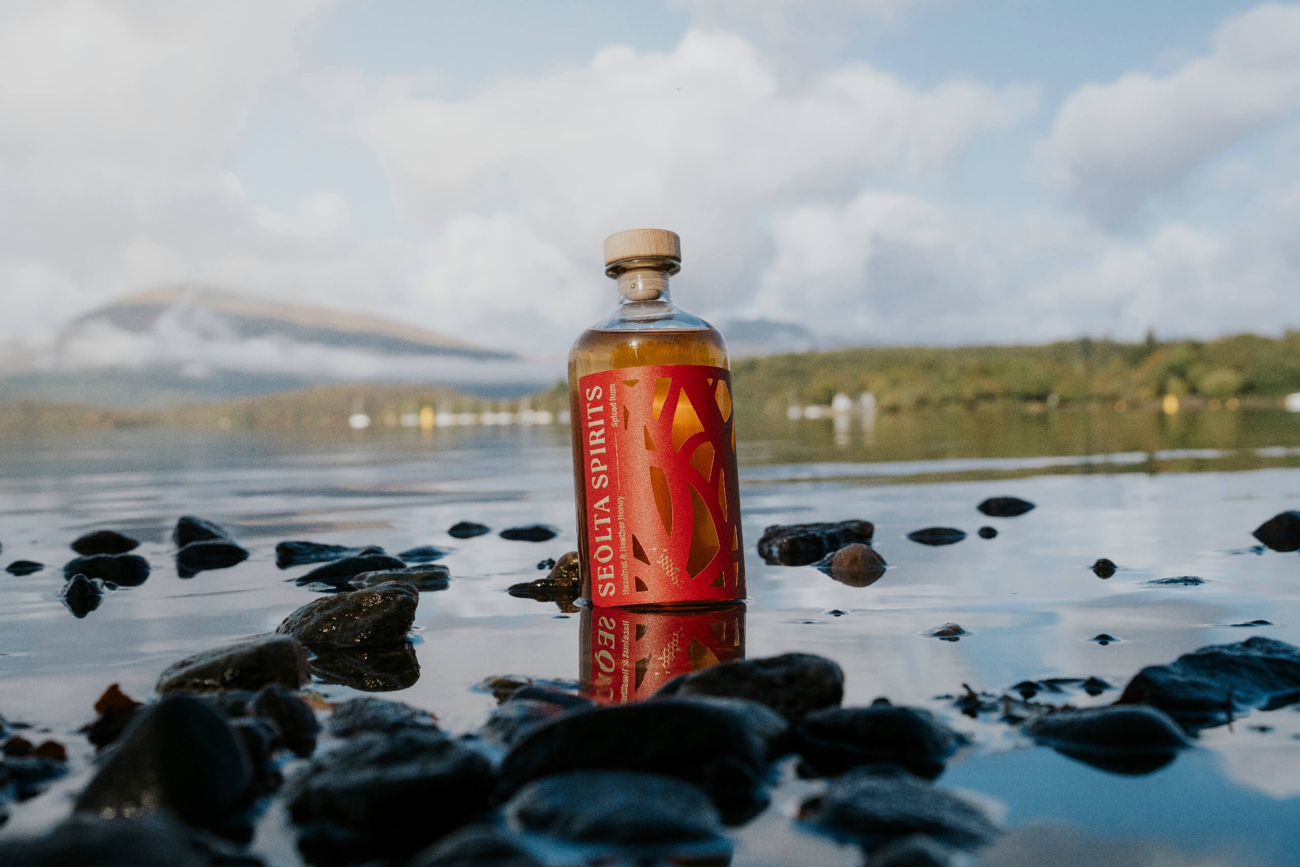
Designed by My Creative, Seolta Spirits’ packaging leans on a striking wrap label that makes me think every label needs to be die-cut. The deep red panel is sliced into winding shapes that allow the bottle’s amber color to come through, turning the spirit itself a critical element of the design.

A narrow vertical typographic layout keeps the brand name clean and legible while letting the label take over the visual field, as it should. The matte paper texture contrasts with the glass, giving the bottle a tactile presence without overwhelming it.


Source link

Get Packaging Industry News updates

Get the most critical Packaging Industry news in your email each week.


We promise no spam email will send you.

Leave a Reply

Your email address will not be published. Required fields are marked *

Related Articles
Tessas Eplegård Cider Explores Honest, Farm-Friendly Storytelling
Barbara RuckerApr 15, 2026

While the rest of the cider world is leaning into rustic scripts and moody…

Pasta Fortuna Tells the Story of a Mother’s Love and a Land of Tradition
Barbara RuckerApr 15, 2026

There’s no denying that the CPG design world is deep in its maximalist renaissance,…

Sky Barn Desiged the Future of Oat Milk We Were Promised
Barbara RuckerApr 15, 2026

Just when the alternative milk aisle had fully committed to a uniform language, Sky…

Coram CVS Specialty shifts to paper-based drug packaging
Barbara RuckerApr 15, 2026

Much of the new system uses a “nested box” approach, allowing shipments to be…