Hyperion Hits All the Right Notes With Its Saxophone Packaging

Hyperion Hits All the Right Notes With Its Saxophone Packaging


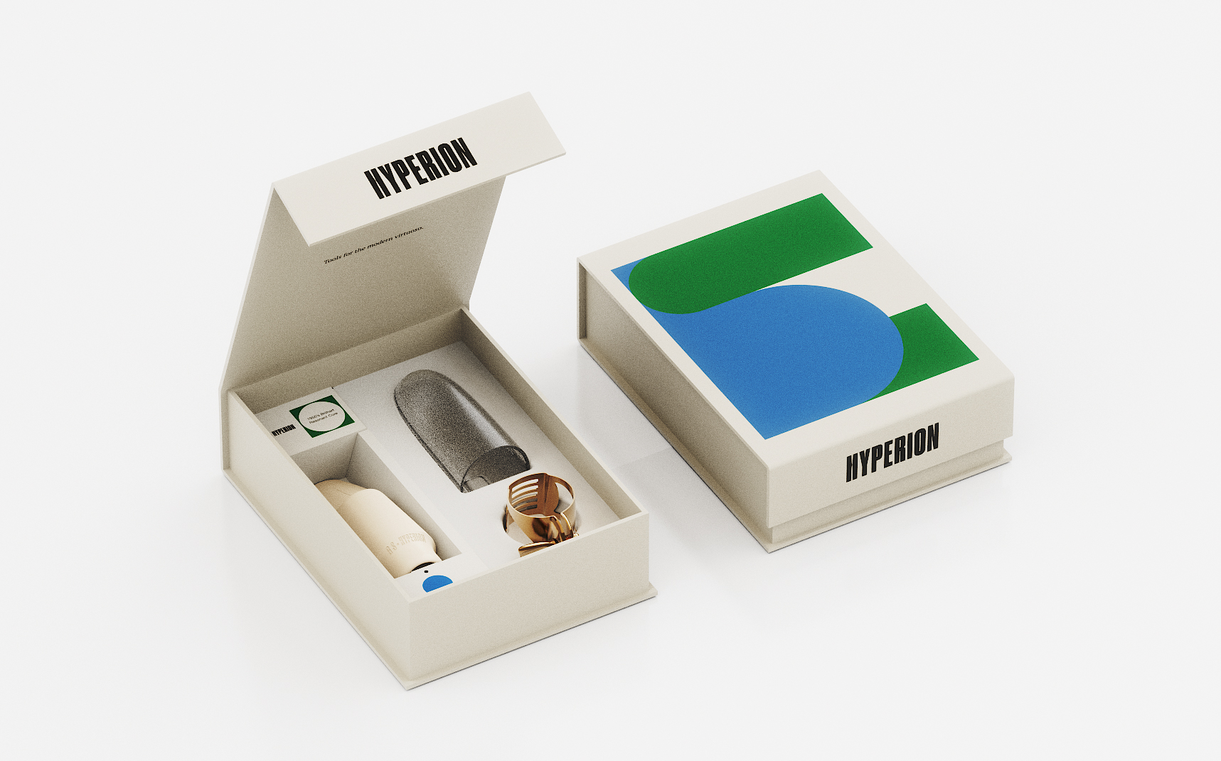
Hyperion’s saxophone accessory packaging, designed by Vert Design Studio, fully leans into mid-century design.

The packaging pairs a stark, condensed wordmark with soft geometric color blocks that feel borrowed from Bauhaus design. The off-white box stock and quiet layout give the product room to breathe, framing the sax accessory like an instrument, not a gadget.

The music accessory category hasn’t seen design this beautiful, well, ever (feel free to send us some shining examples). Glad to see Hyperion switching things up. 


Source link

Get Packaging Industry News updates

Get the most critical Packaging Industry news in your email each week.


We promise no spam email will send you.

Leave a Reply

Your email address will not be published. Required fields are marked *

Related Articles
Moozy Put Milk In A Can
Barbara RuckerJun 17, 2026

I’m not sure anything has been repackaged as much or as often as milk. …

Tetra Pak Unveils Industry-First Carton Packaging for Shelf-Stable Tuna
Barbara RuckerJun 17, 2026

Tetra Pak, in collaboration with the Spanish leading seafood producer Jealsa, has unveiled the…

Blue Diamond Almonds Unveils New Flavors and Updated Look
Barbara RuckerJun 17, 2026

Blue Diamond Almonds is officially entering its next chapter, with the company’s first major…

dummy-img
Get into the Multicultural, Controlled Chaos of Daniela Barrio de Mendoza
Barbara RuckerJun 17, 2026

Branding and packaging designer Daniela Barrio de Mendoza has a little thing called point…