Highlands Coffee Brews Up a Bold Wordmark and Ascendant Peaks

Highlands Coffee Brews Up a Bold Wordmark and Ascendant Peaks


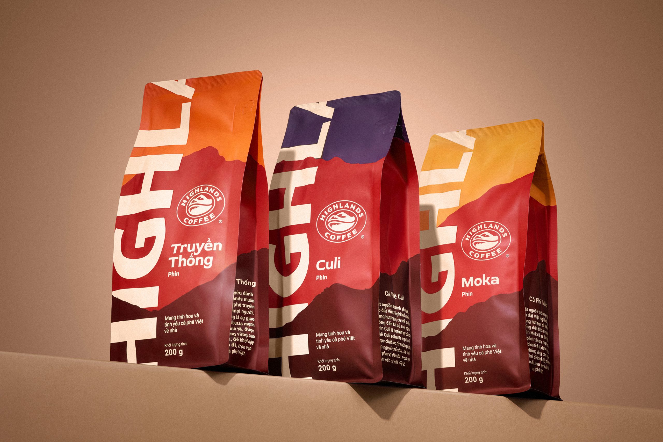
When it comes to packaging design, sometimes playing around with scale is exactly what you need to make a design pop. Highlands Coffee’s packaging by Base Design does just that for the Vietnamese coffee.

Typography slices across the bag, turning the brand name into a structural element rather than a label. Layered color fields in rust red, ochre, and deep plum highlight roasting depth, while subtle mountain silhouettes ground the design. Compared to ornate specialty bags, this design favors confidence.


Source link

Get Packaging Industry News updates

Get the most critical Packaging Industry news in your email each week.


We promise no spam email will send you.

Leave a Reply

Your email address will not be published. Required fields are marked *

Related Articles
The Recycling Partnership Launches New Initiative to Boost Recycling Participation
Barbara RuckerJun 12, 2026

The Recycling Partnership (The Partnership) has announced a Recycling Participation Fund, backed by Arconic,…

Turner Duckworth Refreshes McDonald’s Sub-Brand McCafe As Part Of Larger Beverage Push
Barbara RuckerJun 12, 2026

McCafe, McDonald’s beverage sub-brand, gets a refresh by Turner Duckworth. The update comes as…

This Ain’t Your Grandma’s (Fig) Newtons
Barbara RuckerJun 12, 2026

Newtons’ branding and packaging design have been updated. The update aims to connect with…

Poderi Macchia’s Tactile Design System Is Shaped by Architecture
Barbara RuckerJun 12, 2026

Italian wine labels are breaking free from crests and calligraphy scripts. Poderi Macchia, with…