Right now, there is a genuinely exciting counter-movement happening in Italian aperitivo culture, where a new generation of brands is turning away from the spritz-ification of everything and reaching back into regional history to find something with actual roots.
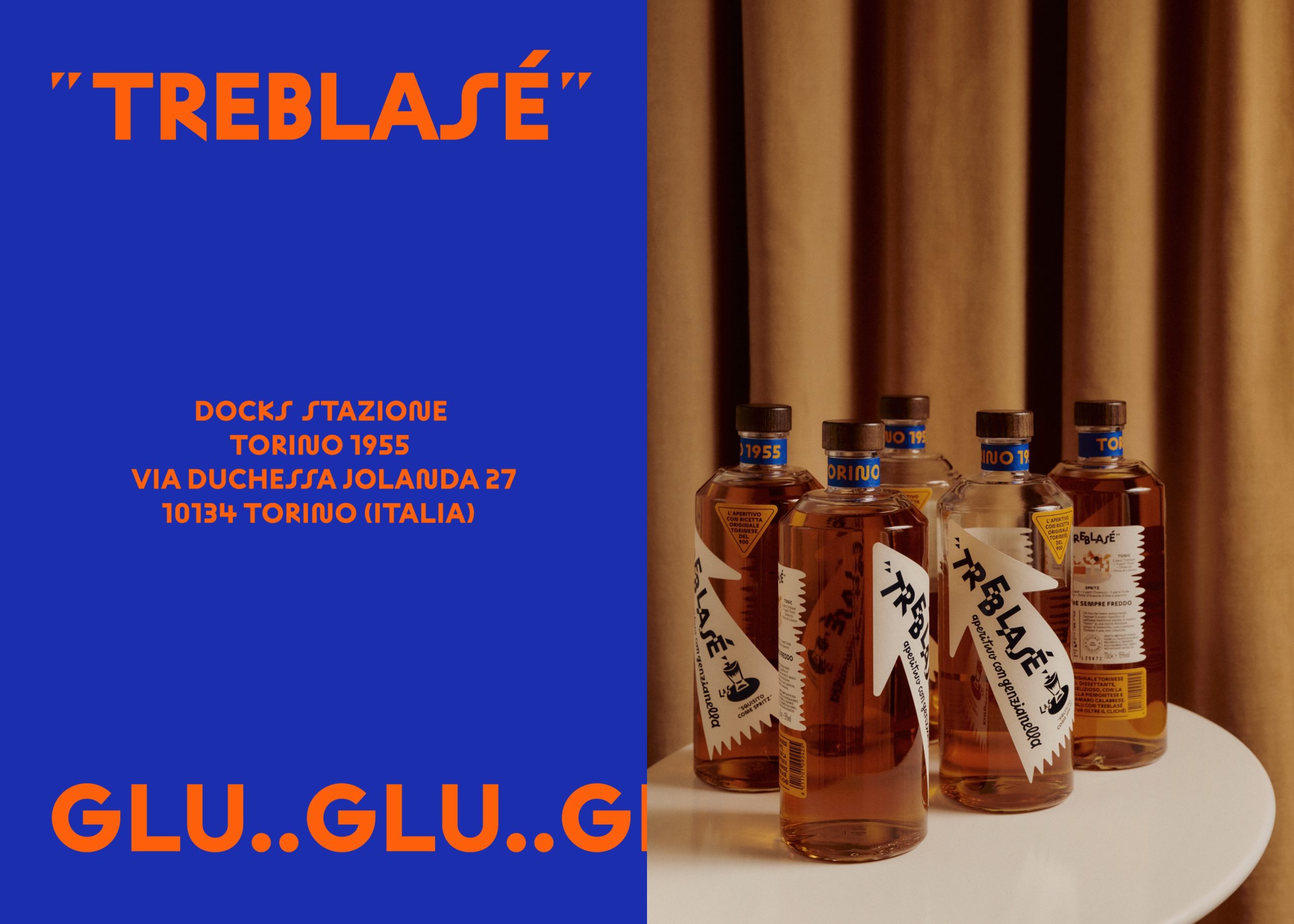
Oslo-based studio OlssønBarbieri designed the identity for this Turin aperitivo, Treblasé, drawing directly from Italian Futurism, specifically the graphic language of Fortunato Depero, whose 1926 Campari poster famously blurred the line between advertising and art, and which somehow also looks completely current.
Treblasé is different from the wave of craft aperitivo bottles crowding the shelf right now because it earns its historical references through specificity. Every typographic choice, color, and even the onomatopoeic phrases like bla-bla and glu-glu pulled from the Futurist literary tradition of Parole in Libertà, build a design system that is unmistakably Torinese while feeling like something you have never quite seen before.