Aqua Libra Finds The Joy In Water

Aqua Libra Finds The Joy In Water


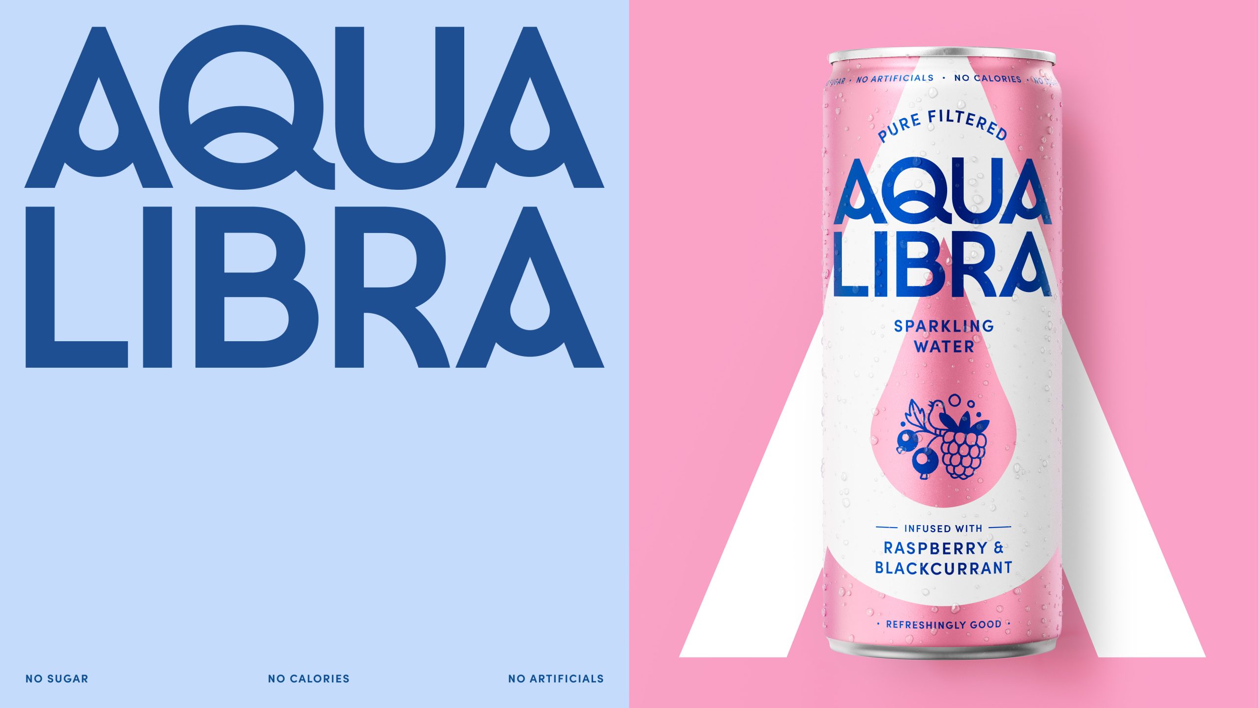
The hydration category is drowning in the same icy blue minimalism, so when a can shows up wearing electric pink, citrus green, it quickly stands out. 

Magpie Studio‘s redesign for Aqua Libra translates the brand’s “Refreshingly Good” positioning into a playful yet elevated visual language. The typography leans into a wide, compressed sans serif for the Aqua Libra wordmark, which commands the upper half of the can with real confidence. The multipack boxes, where those same illustrations explode across the entire surface in vivid flat color combinations of hot pink, orange, and chartreuse, turn a stack of boxes into something a bit more interesting. 


Source link

Get Packaging Industry News updates

Get the most critical Packaging Industry news in your email each week.


We promise no spam email will send you.

Leave a Reply

Your email address will not be published. Required fields are marked *

Related Articles
CTK Bio Canada Launches Compostable Pallet and Food Wrap Solutions
Barbara RuckerJun 5, 2026

CTK Bio Canada today announced the launch of Earth Edition Home Compostable Pallet Wrap…

Lagunitas and Iron Maiden Partner On Latest ‘Trooper’ Beer
Barbara RuckerJun 5, 2026

As part of Iron Maiden’s current world tour, the band has partnered with Lagunitas…

Almonte Proves Premium Olive Oil Deserves More Than A Squeeze Bottle
Barbara RuckerJun 5, 2026

The olive oil category has been a hot topic in the CPG space, particularly…

Young Jerks’ Eastern Gold Looks Like It’s Been on the Shelf Since 1987
Barbara RuckerJun 5, 2026

I’m of the belief that esoteric and mysterious imagery on packaging creates a sense…