Named for the signature checkerboard design of its founding company, Ralston Purina, Rice Chex is one of America’s best-known cereal brands. Yet many people today know Chex (now owned by General Mills) as much for its bagged snacks as for its role as a breakfast staple.
Decades ago, clever homemakers noticed that cereal served as an excellent base for a snack mix, and the brand provided a recipe for its “Chex Party Mix” on boxes of its cereal. It was hollow and crunchy and was able to hold other ingredients like melted butter, spices and Worcestershire sauce—plus, it paired well with mixed nuts, pretzels and other crunchy snacks. Chex became connected with this distinctive and versatile snack, and a bagged, pre-made version of the mix appeared in stores in the 1980s.
Today, the cereal and the snack operate independently—you can find bagged Chex Mix virtually anywhere, and it’s more common than the cereal itself. With its latest redesign, however, Rice Chex recognized an opportunity to celebrate the dual-use dynamism of its product with a new package design.
Key creative changes
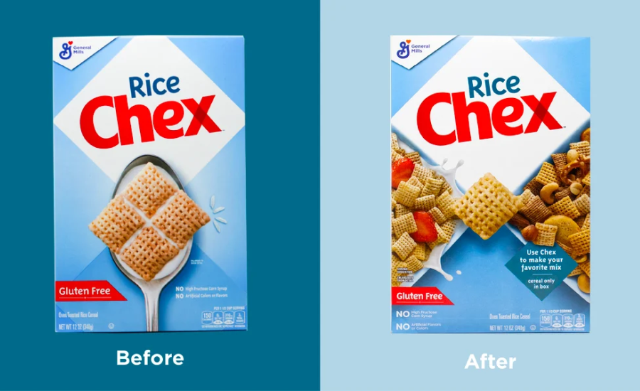
First and foremost, Rice Chex doubled up on conveying occasions for the cereal. Before, there was a single spoon in the foreground, holding the cereal (interestingly in a four-piece diamond) and milk.
In the new design, they’ve cleverly utilized the checkerboard aesthetic to create a split-screen feel—on one side is a bowl of Rice Chex with milk and strawberries, on the other a bowl of Chex-heavy snack mix. Sweet and savory, breakfast-time and snack-time… the brand is pitching its product as a Swiss army staple in the pantry.f
In addition to showcasing the versatility of the product, the visual also subtly promotes other Chex cereals by featuring them in the pictured mix. The implication? If you’re going to make this snack mix, you’ll need more than just Rice Chex… why not add another of our products as well? It’s a recipe suggestion, rather than a direct cross-sell. In case the imagery didn’t close the deal, the brand also added a subtle “make your favorite mix” suggestion next to the snack bowl.
The ingredient imagery has also been updated. Whereas the old version shows a static visual, the updated look features more color (strawberries in the cereal bowl) and variety (the nuts and pretzels in the snack bowl) as well as showing the texture of the cereal up close.
In addition to these substantive changes, the brand made more subtle ones as well. It kept the red “Gluten Free” claim as before but stacked the other exclusion language underneath to streamline communication.
The bottom line
This redesign was a clear winner: 82% of consumers preferred to purchase the new design over the old.
Redesign wins and oppo
Showing two different ways to enjoy Rice Chex was an unmitigated success. Consumers loved that it showed the versatility of the cereal, and it reminded them of its status as a dual threat in the kitchen.
This new imagery was so tantalizing to consumers that it topped the previous design in communicating every one of the top 12 most important attributes by a head-turning average of 60 points. It was utterly dominant in the top three most important attributes to consumers (in order of importance to consumers): “tastes great” (+58 points versus the old design), “high quality” (+44 points), and “made with real ingredients” (+63 points). Only on rare occasions have we seen such striking improvements in communication.
That number one attribute—“tastes great”— is king of communication when it comes to food and beverage brands, and this design absolutely crushed it in conveying appetite appeal. The brand leveraged a clear competitive advantage by showing its product in use in more than one way. One consumer said it well: “The picture makes it look really tasty, and you can see what can also be done with the product.” In other words, it not only looked delicious, it offered possibilities.
Consumers also noted the deep blue color, which was repeatedly referred to as “brighter,” “vibrant,” and “visually appealing.” Overall, Rice Chex accomplished an impressive feat—a clear upgrade over the previous design, without departing from the look-and-feel that has defined the brand for 75 years.
Wins:
- When asked which words come to mind upon viewing each design, consumers responded with positive words (like “healthy” and “good”) far more often for the new design than the old (42% vs. 27%).
- Consumers were more likely to say the new design was “healthy” than the category overall. This could represent a competitive advantage that could be further leveraged moving forward.
- As mentioned above, the new design beat the old in communicating all 12 most important attributes in the category. In fact, the largest improvements were in conveying the attributes that are most important (the top four attributes) to consumers overall.
- Quite a bit changed with this new design, but it still generally looks familiar, which is a win for the brand. This was an excellent job of maintaining brand equity while giving consumers even more reason to choose Rice Chex.
- The combination of doubling the suggested utility of the product (showing two uses), adding even more appetite imagery (almost always a bonus), and adding subtle visual cues to buy other products in the family (Corn Chex and Wheat Chex) is a masterclass in multi-occasion marketing.
Opportunities
There’s no question that this redesign was a resounding success, but Rice Chex faces stiff competition in the cereal aisle. Other major brands maintain a strong lead in overall design performance. So while this new look was a major improvement over the previous version, the brand still has work to do to catch up with top-tier, legacy peers when it comes to design effectiveness.
This article was originally published by Designalytics.