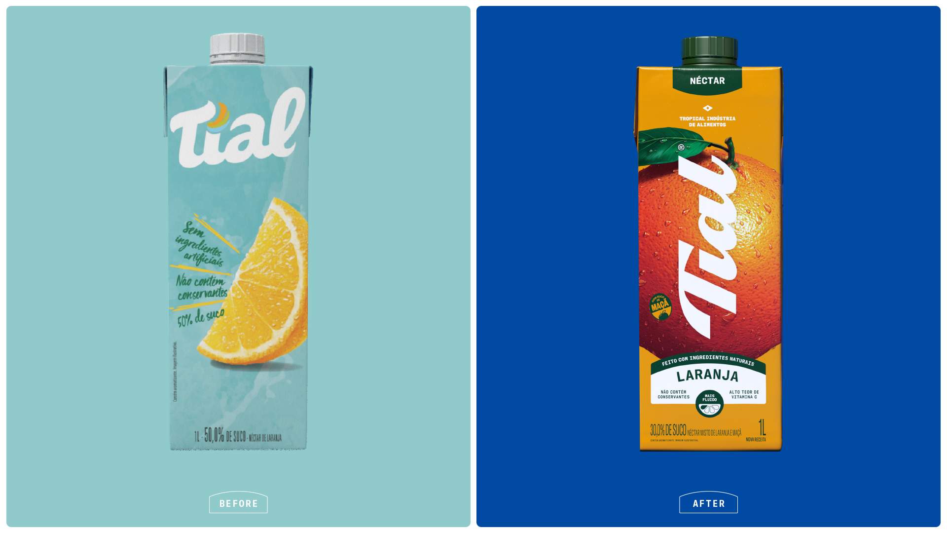
Brazil’s street markets, hand-painted signs, and overflowing fruit stalls are full of inspiration, and Tial’s redesign by HardCuore honors that culture at the scale it deserves.
Where the previous packaging sat quietly behind pale blues and a modest fruit illustration, the new system puts oversized photographic fruit in complete control of every carton, with each variety filling the entire face of the pack, making guava, passion fruit, mango, and pineapple feel irresistible. The Tial script logotype runs diagonally across the fruit in flowing white, directly referencing the handwritten signage of Brazilian open-air feiras, while the cobalt blue of the 100% juice line and the warm golden amber of the néctar range create a two-tier color system.
This is fruit as pure appetite appeal, and it is one of the most joyful and confident juice rebrands we’ve seen recently.