Embracing The Power of Simplicity With Nutrire

Embracing The Power of Simplicity With Nutrire


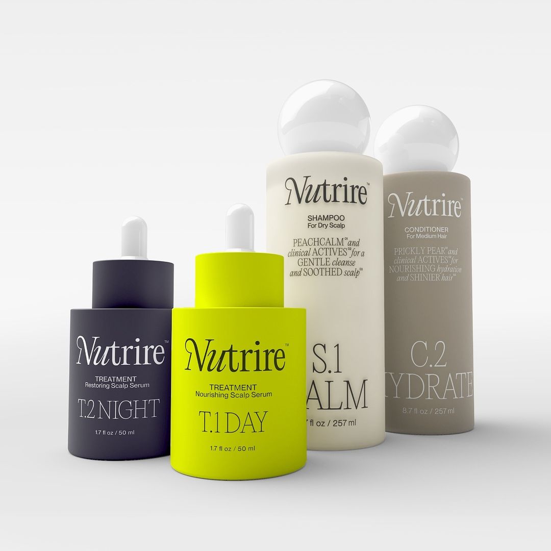
ESTABLISHED’s packaging design for Nutrire embraces simplicity, centering around sleek, minimalist typography paired with a soft, organic color palette, punctuated by a striking pop of chartreuse for the T1 Day treatment. The shampoo and conditioner bottles feature a distinctive round top, adding a touch of design sophistication and polished charm to the overall aesthetic, making the products feel both luxurious and approachable.


Source link

Get Packaging Industry News updates

Get the most critical Packaging Industry news in your email each week.


We promise no spam email will send you.

Leave a Reply

Your email address will not be published. Required fields are marked *

Related Articles
The Recycling Partnership Launches New Initiative to Boost Recycling Participation
Barbara RuckerJun 12, 2026

The Recycling Partnership (The Partnership) has announced a Recycling Participation Fund, backed by Arconic,…

Turner Duckworth Refreshes McDonald’s Sub-Brand McCafe As Part Of Larger Beverage Push
Barbara RuckerJun 12, 2026

McCafe, McDonald’s beverage sub-brand, gets a refresh by Turner Duckworth. The update comes as…

This Ain’t Your Grandma’s (Fig) Newtons
Barbara RuckerJun 12, 2026

Newtons’ branding and packaging design have been updated. The update aims to connect with…

Poderi Macchia’s Tactile Design System Is Shaped by Architecture
Barbara RuckerJun 12, 2026

Italian wine labels are breaking free from crests and calligraphy scripts. Poderi Macchia, with…