Ooma Positions the Magic Mushroom As a Vehicle For Wellness

Ooma Positions the Magic Mushroom As a Vehicle For Wellness


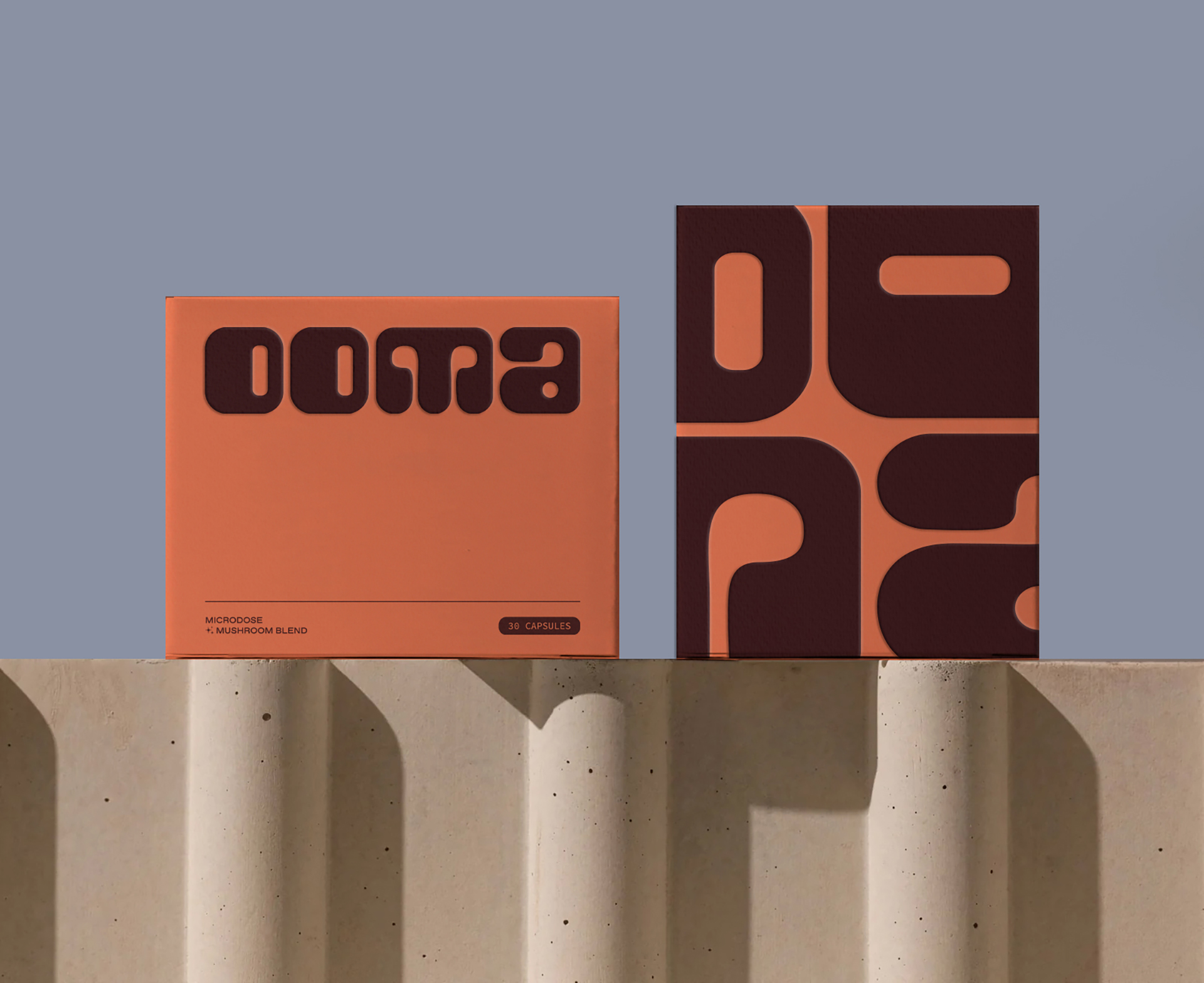
The packaging design for Ooma, created by Forner, is a blend of boldness and warmth, featuring a rich orange color palette that is both energizing and grounding, reflecting the benefits of the product.

The playful, chunky typography with rounded edges highlights the natural form of mushrooms, while providing a sense of comfort. The brand’s deeper purpose is to reframe mushrooms as a wellness tool rather than a novelty, and the packaging helps reflect these sentiments. Ooma’s logo and visual identity balance joy, creativity, and calmness, appealing to those looking for a holistic approach to cognitive wellness.


Source link

Get Packaging Industry News updates

Get the most critical Packaging Industry news in your email each week.


We promise no spam email will send you.

Leave a Reply

Your email address will not be published. Required fields are marked *

Related Articles
Cattyfeast Turns Cat Food Into Design Purrfection
Barbara RuckerApr 15, 2026

REWOT s.r.l. gave FIDOVET’s Cattyfeast gold foil cans and a saturated flavor-coded palette that…

The Return of the Stubby? Garage Beer Bets on Stout Bottles and 24-Can Buckets
Barbara RuckerApr 15, 2026

Garage Beer resurrects the stubby bottle and drops a 24-pack hardware bucket to stand…

Geopolitical risk reshapes packaging investment case
Barbara RuckerApr 15, 2026

Investors are shifting their focus beyond traditional growth metrics to examine how well companies…

Sappi to Showcase Sustainable Tea Packaging at interpack
Barbara RuckerApr 15, 2026

At this year’s interpack, Sappi will be highlighting its latest innovations in sustainable tea…