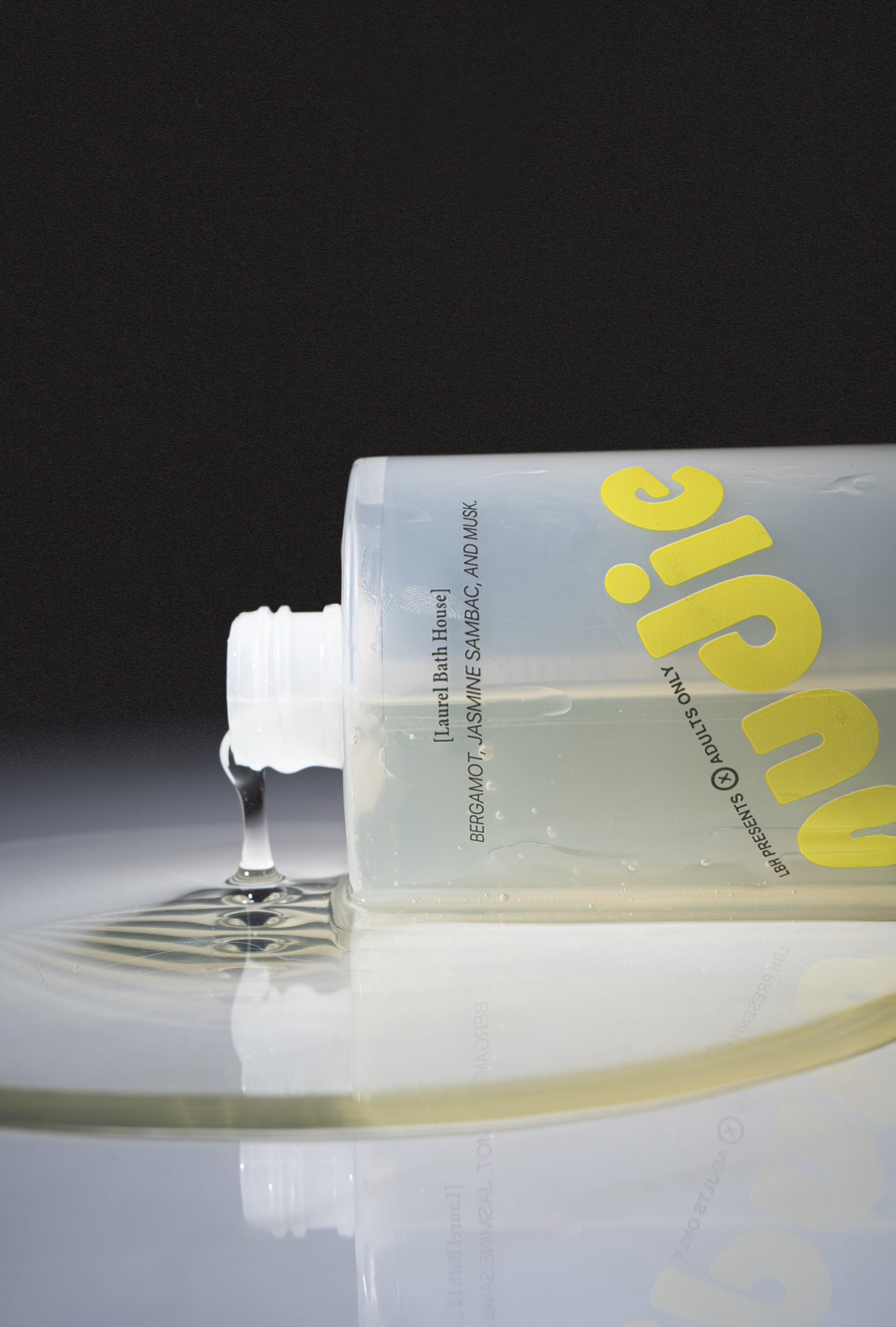
Designed by David Teitelbaum, Nudie’s packaging leans into a stripped-down, playful aesthetic that makes cleanliness feel pleasurable.
The translucent bottle keeps things minimal, while the typography is bold yet warm, with the brand name in a rounded yellow type that feels almost hand-drawn, while the contrasting red and black text below adds a hint of retro-inspired design. The design pulls a sunset-toned striping on the box that hints at nostalgia.