Dorot Gardens’ Makeover Moves In A Fresh, New Direction

Dorot Gardens’ Makeover Moves In A Fresh, New Direction


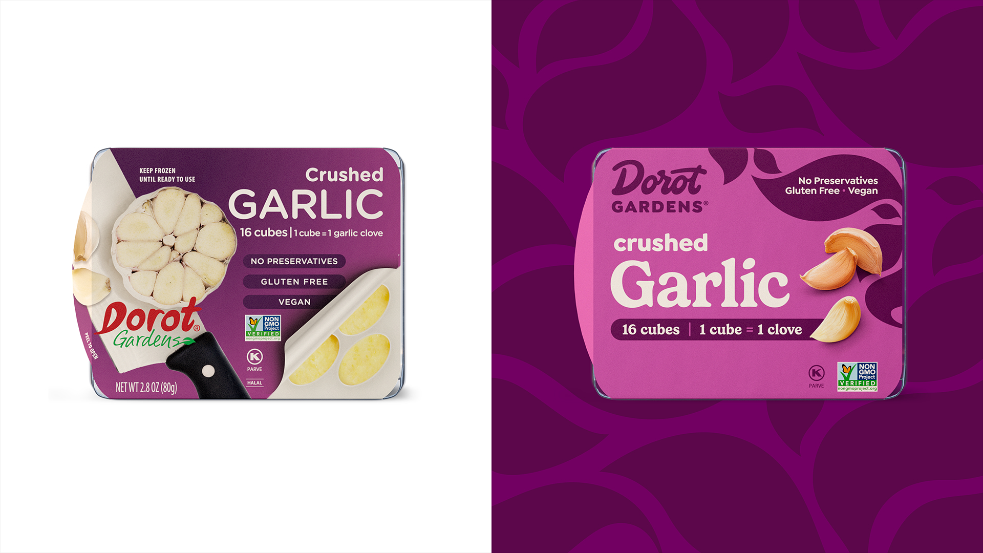
Dorot Gardens’ packaging received a bold refresh courtesy of Chase Design Group, swapping a dated, muted look for striking color blocks and sleek typography. The old design leaned on dark tones, realistic ingredient imagery, and a more traditional aesthetic.

Now, each variety pops with a specific, high-contrast shade, making it easy to distinguish flavors at a glance. The typography is clean yet playful, but still dependable. The curved leaf-like patterns add a subtle organic touch, hinting at freshness while keeping the look polished.

Lindsey Reveche, Design Director at Chase Design Group gives us more insight behind the redesign below.


Source link

Get Packaging Industry News updates

Get the most critical Packaging Industry news in your email each week.


We promise no spam email will send you.

Leave a Reply

Your email address will not be published. Required fields are marked *

Related Articles
Tessas Eplegård Cider Explores Honest, Farm-Friendly Storytelling
Barbara RuckerApr 15, 2026

While the rest of the cider world is leaning into rustic scripts and moody…

Pasta Fortuna Tells the Story of a Mother’s Love and a Land of Tradition
Barbara RuckerApr 15, 2026

There’s no denying that the CPG design world is deep in its maximalist renaissance,…

Sky Barn Desiged the Future of Oat Milk We Were Promised
Barbara RuckerApr 15, 2026

Just when the alternative milk aisle had fully committed to a uniform language, Sky…

Coram CVS Specialty shifts to paper-based drug packaging
Barbara RuckerApr 15, 2026

Much of the new system uses a “nested box” approach, allowing shipments to be…