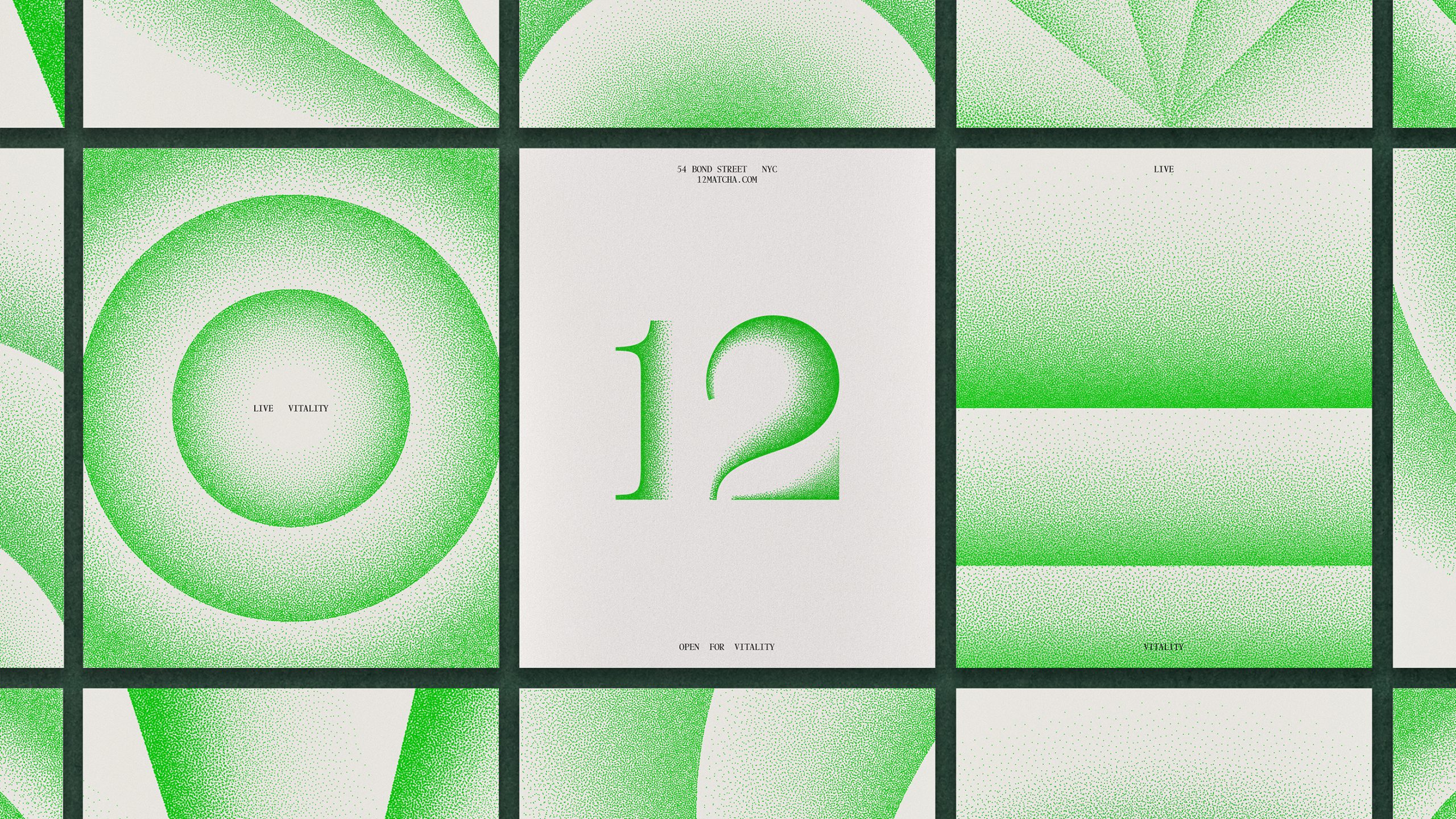
Base Design’s work for 12 leans into simplicity with precision. The packaging uses a crisp white base with soft airbrushed gradients of matcha green across the box, creating a sense of calm clarity.
The oversized “12” is set in a serif typeface with an ink-dot texture, giving it a tactile quality that echoes tea leaf powder. The typography is minimal, set in a tight, mechanical alignment, nodding to scientific labeling, but still balanced by the colors and patterns.