Resort’s Packaging Feels Like a Vacation in a Can

Resort’s Packaging Feels Like a Vacation in a Can


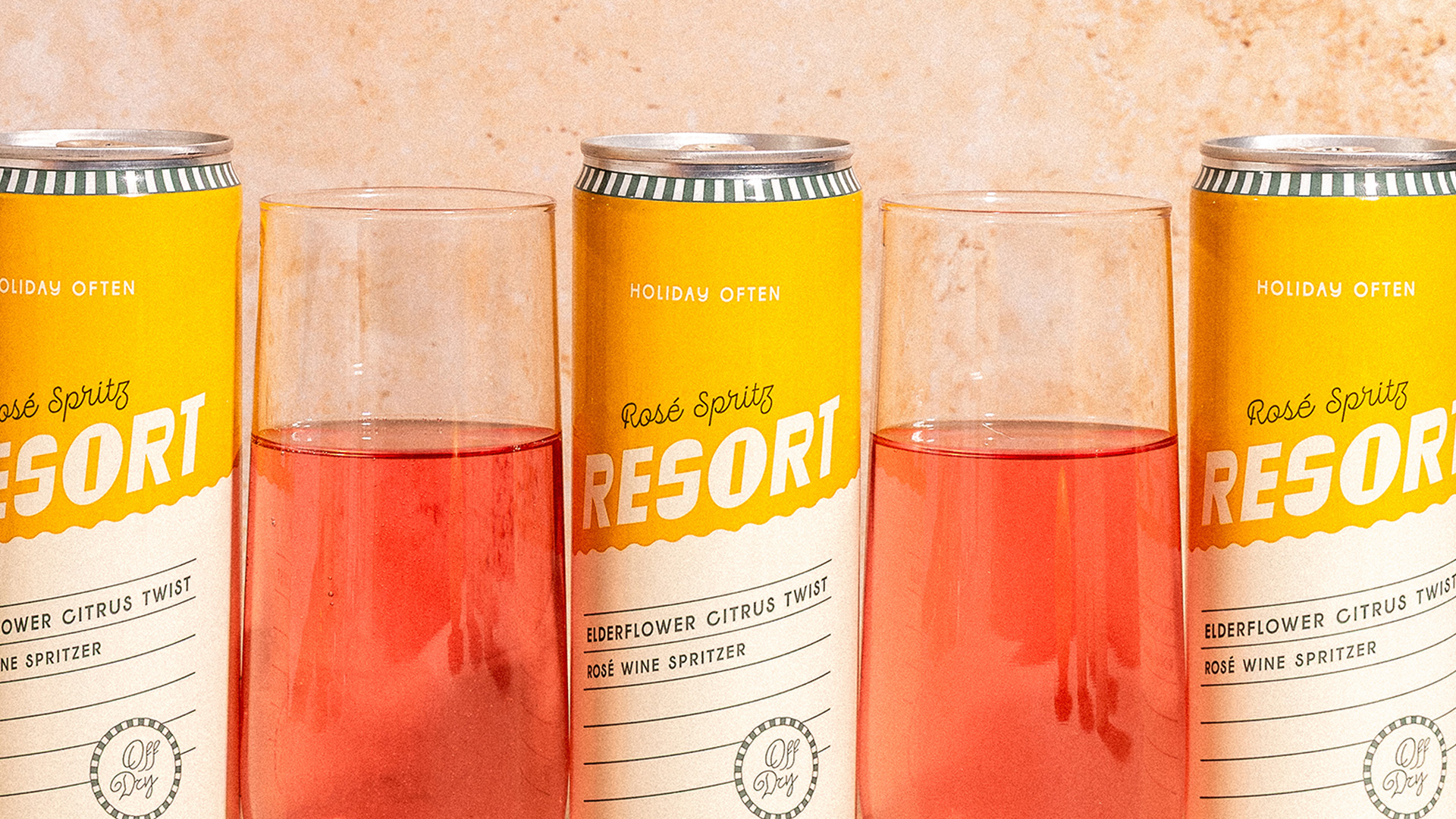
Resort’s packaging by Public House Studio reads like a postcard from a permanent vacation.

The can is split into sunny yellow and warm cream with a playful wave dividing the two, nodding to poolside umbrellas and beach towels. “Holiday Often” caps the can like a casual command. The bold, italicized “RESORT” lettering leans back like it’s lounging. A striped detail around the rim gives it a retro boardwalk twist, while fine lines add a subtle structure to the carefree vibe.


Source link

Get Packaging Industry News updates

Get the most critical Packaging Industry news in your email each week.


We promise no spam email will send you.

Leave a Reply

Your email address will not be published. Required fields are marked *

Related Articles
The Recycling Partnership Launches New Initiative to Boost Recycling Participation
Barbara RuckerJun 12, 2026

The Recycling Partnership (The Partnership) has announced a Recycling Participation Fund, backed by Arconic,…

Turner Duckworth Refreshes McDonald’s Sub-Brand McCafe As Part Of Larger Beverage Push
Barbara RuckerJun 12, 2026

McCafe, McDonald’s beverage sub-brand, gets a refresh by Turner Duckworth. The update comes as…

This Ain’t Your Grandma’s (Fig) Newtons
Barbara RuckerJun 12, 2026

Newtons’ branding and packaging design have been updated. The update aims to connect with…

Poderi Macchia’s Tactile Design System Is Shaped by Architecture
Barbara RuckerJun 12, 2026

Italian wine labels are breaking free from crests and calligraphy scripts. Poderi Macchia, with…