Blim Skincare Ditches Soft Neutrals for Sharp Edges and Bolder Blocks

Blim Skincare Ditches Soft Neutrals for Sharp Edges and Bolder Blocks


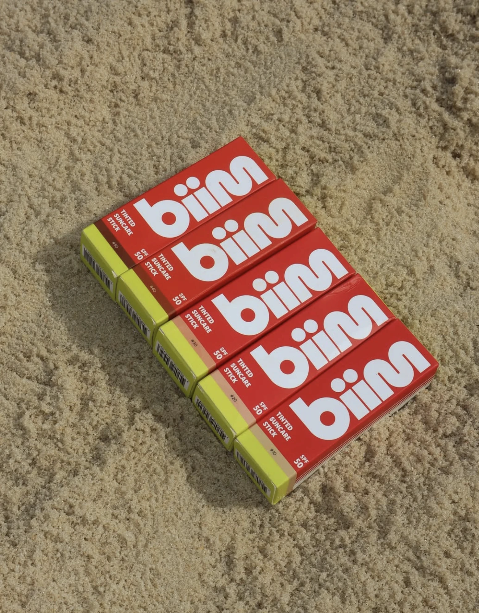
Blim Skincare’s packaging, designed by Project Yuli, plays with bold geometry and crisp type to full effect. The vertical logotype disrupts the typical skincare shelf language, combining oversized, softened sans-serif characters with clean color blocking.

The high-contrast palette with its punchy red, yellow, and whites carries through from the carton to the product itself, making it instantly scannable. The typographic system does most of the heavy lifting, keeping things editorial but never overly clinical. It’s sunscreen, but it’s full of emotion.

Yuli M, founder of ProjectYuli, shares more about the design process below.


Source link

Get Packaging Industry News updates

Get the most critical Packaging Industry news in your email each week.


We promise no spam email will send you.

Leave a Reply

Your email address will not be published. Required fields are marked *

Related Articles
The Recycling Partnership Launches New Initiative to Boost Recycling Participation
Barbara RuckerJun 12, 2026

The Recycling Partnership (The Partnership) has announced a Recycling Participation Fund, backed by Arconic,…

Turner Duckworth Refreshes McDonald’s Sub-Brand McCafe As Part Of Larger Beverage Push
Barbara RuckerJun 12, 2026

McCafe, McDonald’s beverage sub-brand, gets a refresh by Turner Duckworth. The update comes as…

This Ain’t Your Grandma’s (Fig) Newtons
Barbara RuckerJun 12, 2026

Newtons’ branding and packaging design have been updated. The update aims to connect with…

Poderi Macchia’s Tactile Design System Is Shaped by Architecture
Barbara RuckerJun 12, 2026

Italian wine labels are breaking free from crests and calligraphy scripts. Poderi Macchia, with…