Raise a Glass to Warburton Wine’s Pleasantly Simple Bottle Design

Raise a Glass to Warburton Wine’s Pleasantly Simple Bottle Design


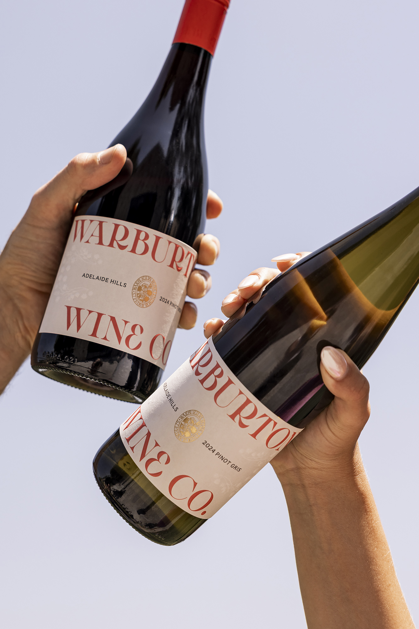
Designed by designed by Roundhouse Studio, Warburton Wine Co.’s packaging uses crisp typography and a pared-back layout that puts the brand name front and center. The serif typeface stretches across the label with just enough breathing room to feel confident without clutter.

Pops of red on the logo and capsule bring a bit of energy, keeping it from feeling too polished. Against a white background, the design feels approachable yet still fit for a dinner party. It’s clean but still elevated, a wine packaging system that’s welcoming to all.


Source link

Get Packaging Industry News updates

Get the most critical Packaging Industry news in your email each week.


We promise no spam email will send you.

Leave a Reply

Your email address will not be published. Required fields are marked *

Related Articles
The Recycling Partnership Launches New Initiative to Boost Recycling Participation
Barbara RuckerJun 12, 2026

The Recycling Partnership (The Partnership) has announced a Recycling Participation Fund, backed by Arconic,…

Turner Duckworth Refreshes McDonald’s Sub-Brand McCafe As Part Of Larger Beverage Push
Barbara RuckerJun 12, 2026

McCafe, McDonald’s beverage sub-brand, gets a refresh by Turner Duckworth. The update comes as…

This Ain’t Your Grandma’s (Fig) Newtons
Barbara RuckerJun 12, 2026

Newtons’ branding and packaging design have been updated. The update aims to connect with…

Poderi Macchia’s Tactile Design System Is Shaped by Architecture
Barbara RuckerJun 12, 2026

Italian wine labels are breaking free from crests and calligraphy scripts. Poderi Macchia, with…