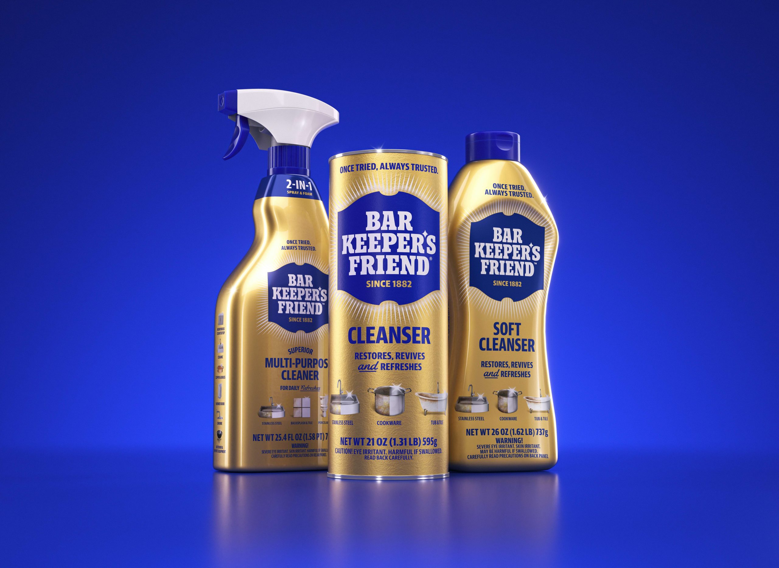
- Bar Keeper’s Friend partnered with design agency JKR to execute a thoughtful brand refresh that elevates the 144-year-old heritage brand and shifts the product’s positioning from a “tough-job” specialty cleaner to an everyday household staple, utilizing a refined visual identity that balances its utilitarian roots with a contemporary, premium look.
- The redesign retains the signature gold metallic can while introducing sophisticated “before-and-after” illustrations and a modernized logo. Key design details include smoothed-out typography and a new “sparkle apostrophe” star, reinforcing the brand’s efficacy and “countertop jewelry” appeal.
It may be called Bar Keeper’s Friend, but since its launch in 1882, consumers have found uses for the scouring powder beyond bars and kitchens. The cleaning brand’s many products are useful throughout the home, as they can safely clean nearly any surface. It’s one of those utilitarian household staples that has proven so effective that it’s built a loyal customer base.