The hydration drink category is plenty saturated; that’s no secret, and most brands have gone full-tilt maximalist to get noticed. It’s exactly why Jous by Studio Unbound did the opposite.
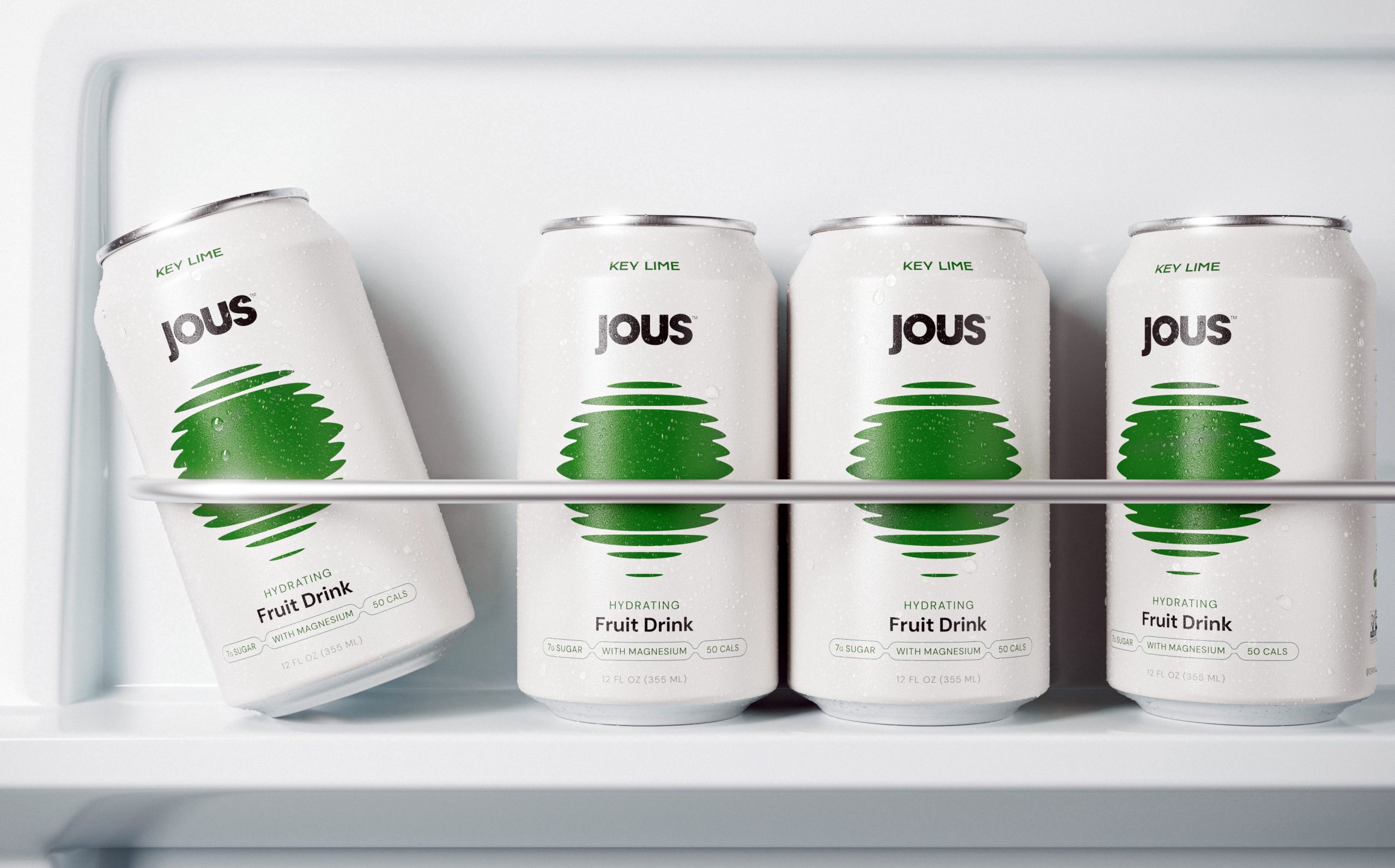
The can is a clean matte white with a single deep green orb at the center, built from stacked horizontal lines that compress and expand like a sound wave or a record groove, a direct visual reference to music culture. The logo sits above the icon in a bold font with just enough weight to anchor the can without competing with the graphic, keeping the hierarchy clean and unpretentious.
Jous treats health and having fun as the same thing on a night out, and the design system makes that argument without having to beg to prove that the two can coexist.