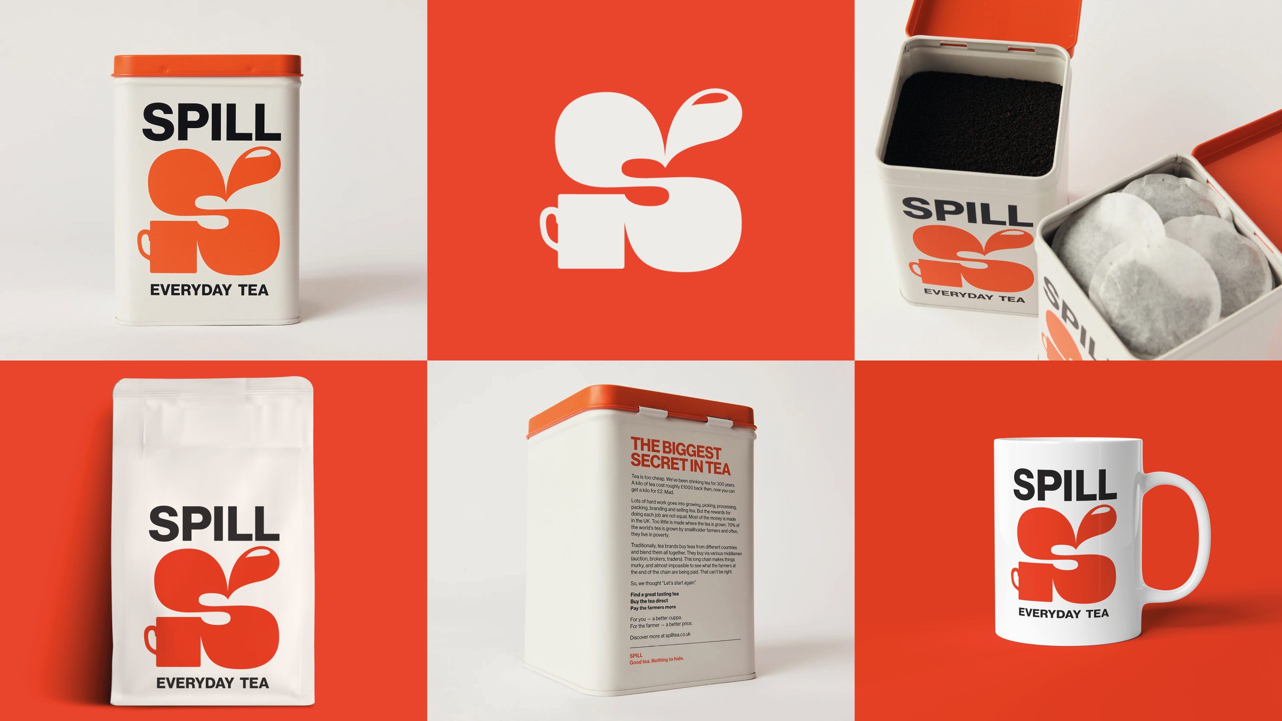
The design agency Hey! What? created a packaging system for Spill that’s bold, direct, and hard to ignore, kind of like the brand’s message. The bright red logo wraps a teacup and splash into a chunky S, and it’s printed big across every pack, tin, and mug.
Paired with a clean black typeface and white background, the contrast does the heavy lifting. Even the back panel of the tin reads more like a manifesto than marketing. It’s bold, simple, and to the point.