- Blant-based brand Epik Eats is reframing the category with a loud and proud rebrand from Pigeon
- Using a bright fuchsia and yellow color palette and big, bold typography, the new Epik Eats packaging breaks the subdued and restrained mold that dominates the plant-based aisle
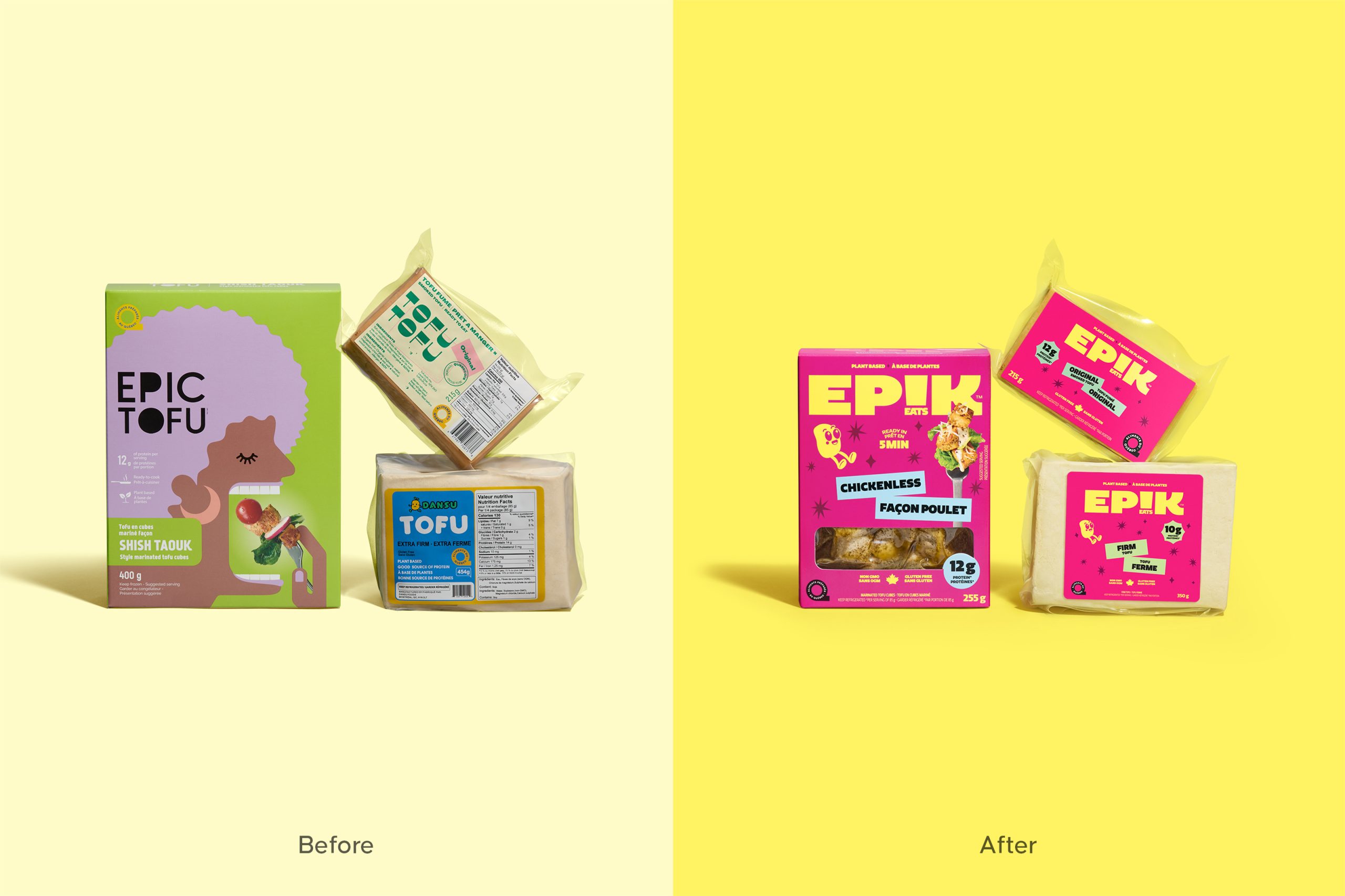
Tofu is a famously low-key sort of food, positioned within a plant-based category that’s similarly restrained. Epik Eats is here to rewrite that narrative, bursting onto the shelf with an explicitly bold and brazen redesign meant to break the mold and shatter industry expectations.
From the agency Pigeon comes a reframing of what a plant-based brand can be—and how it can look on the shelf. Instead of the typical subdued wellness aesthetic that dominates the plant-based aisle, Epik Eats pops with a bright fuchsia box adorned with a chunky wordmark in a sunny yellow. Embedding the “Eats” portion of the brand name within “Epik” to make the “i” into an exclamation point is clever and cheeky, not gimmicky or forced. The move also impressively retains the name’s readability, while adding to the brand’s expressive and loud ethos.