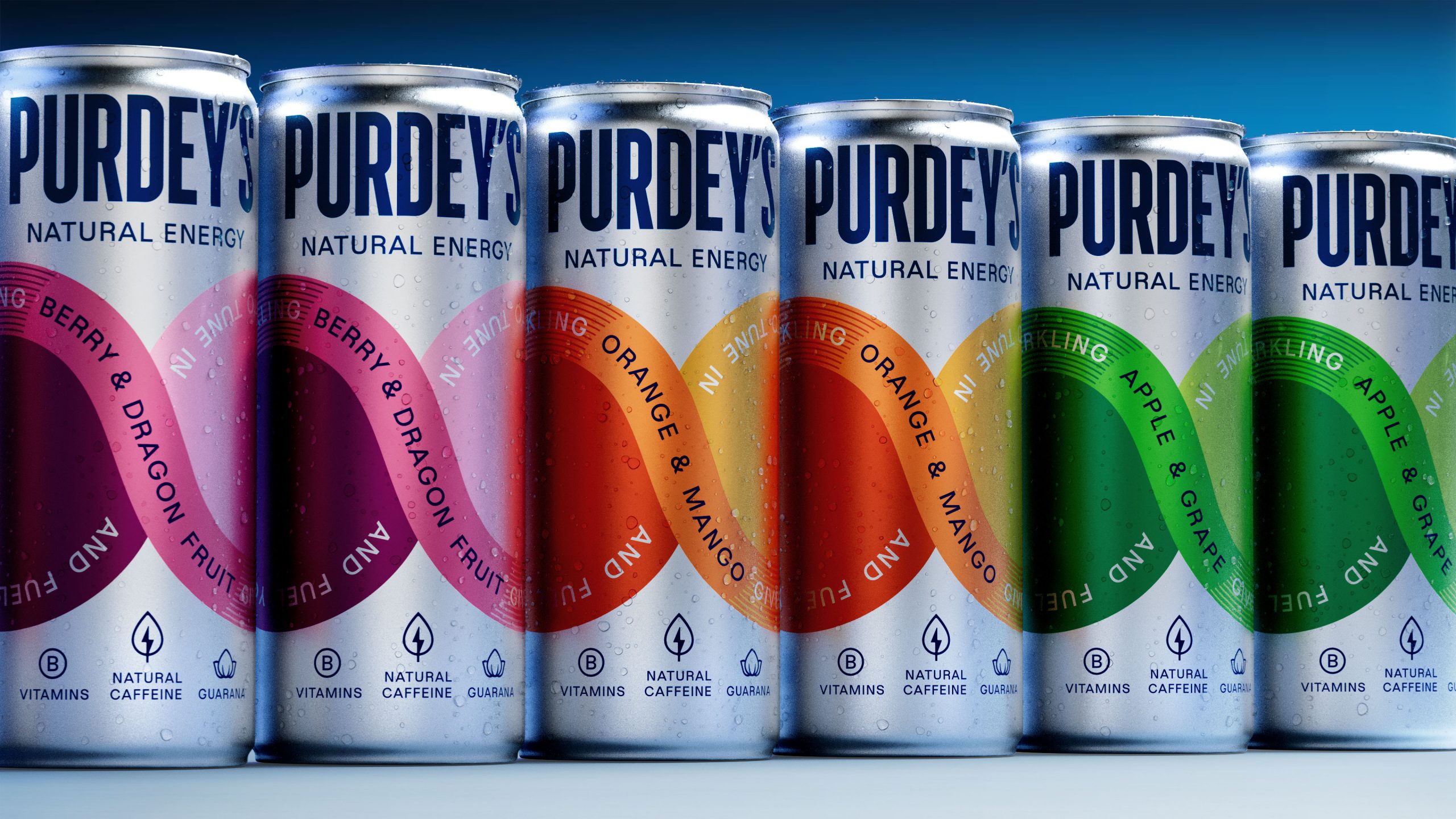
- Purdey’s rebrand by Magpie Studio introduces the Flow Loop, a continuous infinity mark that transforms the entire range into one connected composition on shelf.
- With flavor-coded color palettes and purposeful typography, this is the energy drink redesign that finally makes energy drinks feel as exciting as they should.
Purdey’s rebrand by Magpie Studio trades the energy drink category’s classic neon-fronted aggression for a design rooted in calmness.
The centerpiece of the design is the “Flow Loop,” an infinity mark that wraps each can in a continuous ribbon of color, simultaneously functioning as a flavor identifier and a compositional device that connects every can in the range to its neighbor on the shelf. The color palette nods to real fruit hues rather than artificial flavoring, which is exactly the visual promise the brand needs to make to earn the trust of a new generation of wellness-minded consumers who have officially outgrown the era of a screaming can.